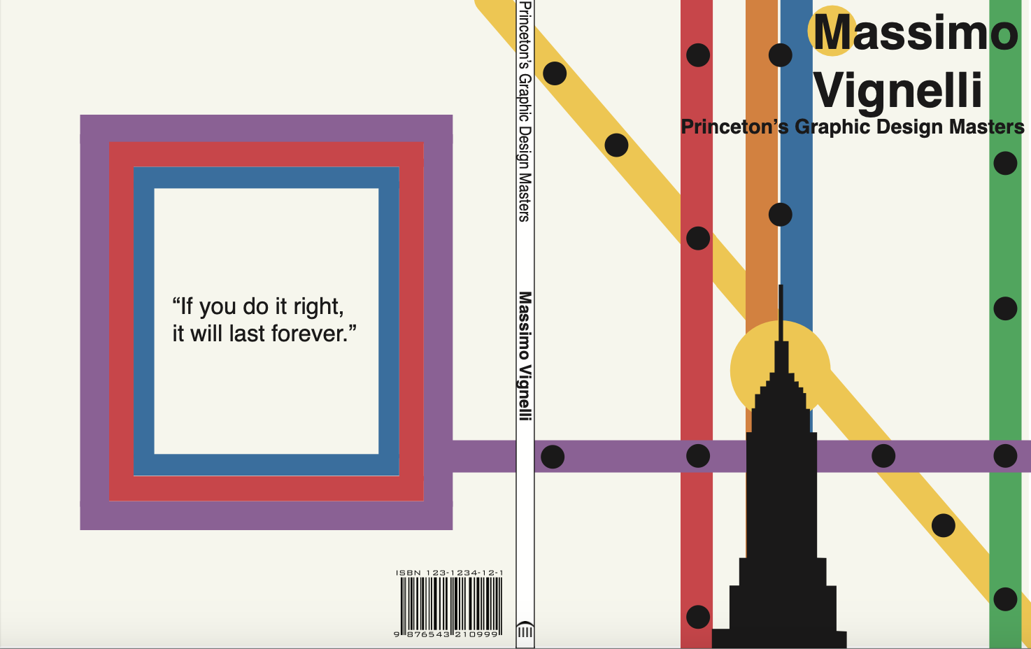
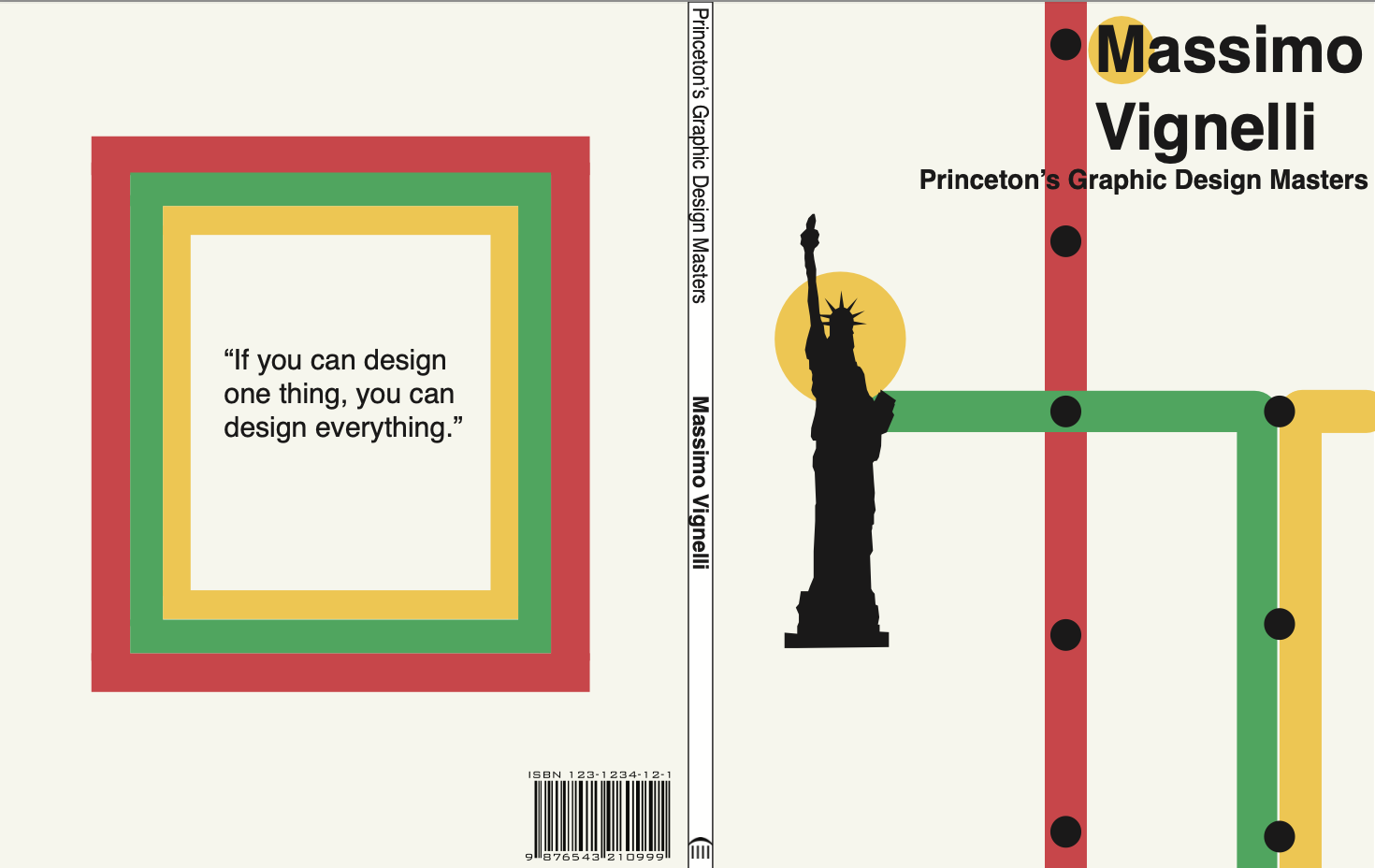
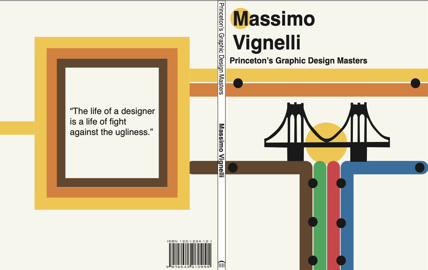
Through research, I identified the lines that currently provide the closest access to the landmarks featured on each cover. I also incorporated circles to indicate where the lines intersect. These circles also represent the landmark stops while symbolizing the sun. Additionally, I placed a yellow dot behind Massimo’s initial “M” to represent the Subway’s M line, reinforcing the connection between the design and the transit system.
Massimo Vignelli Book Cover
For this project I design a three book cover bibliography series inspired by a selected
designer while interpreting their visual language in an original way.
To create this I researched Massimo Vignellis design philosophy and methods,
focusing on his use of Helvetica and his version of the New York MTA Subway map. I developed a cohesive series by incorporating simplified transit line color coded routes that extend from the front and back covers.